UW Night Market
Designed by Xingyue Yang
Displays that exploit the visual potential of relationships
Final display:
General Description:
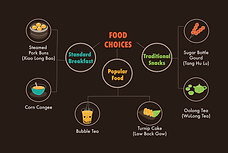
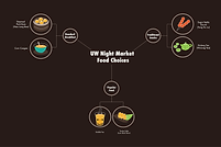
With this display, I am trying to give my audiences a general ideas of the three major kinds of food choices that they can possibly have duing UW Night Market. With various food vendors coming every year, it's hard to demonstrate all the different food choices, so I choose to draw some traditional Chinese food that can represent the Night Market culture. I started with a vertical and horizontal displays of food, both of which don't fit well with my final layout, as there were too many empty spaces. Then with the critiques from peers, I tried to make my relationship displays more unstructured and scattered around my text but still retained the clarity of the hierachical structure to ensure that it would be recognizable and eaily understanded by audiences.
Emulation Description:
I emuulated my relationship display with all of my models, including color, visual language and typography models. With only one font, it's easy to put more colors on different texts which are on different hierachy. I applied my color and visual language models to all the texts and food icons by filling in the color of my food icons and texts in order to follow the visual language models as well.
Sources: The data/inspiration for this display came from the following sources...
First Iteration
version 1
version 2
Second Iteration
revision 1
revision 2
First Iteration
Critique #1: Tianai Zhao
Tianai pointed out that these two versions personally make sense. But she also noticed that there wer few issues that I can change:
1. Change the title change to be more specific, as there are not only food, but also games, entertainment in night market.
2. She suggested me to label my images, as most of the people don't know what food are they.
She liked my display, as it is very simple and clear. She thinks the category logically make sense.
Model Emulation Feedback
Tianai liked my emulation a lot, because in my visual language model, there are lots of flat design and in my own display, there are also flat icon designs.
Revisions based on this critique
I made the title more specific, indicating it's about food. Also I added the labels for each food.
Critique #2: Yiqing Zhao
Yiqing really likes my design. She gave a few suggestions:
1. Make the line that connect the relationship thicker in order to keep a good balance
2. Make my icons in the same scale
3. Label the images to make it clearer to other audiences who don't know much about those food.
4. For specific images, such as the first one, I should use more colors.
Model Emulation Feedback
She thought I emulated well with my models, the only thing is that for some icons, I should emulate more colors.
Revisions based on this critique
I didn't made my line thicker, as I think the white line is already bright enough that I don't want it to catch users's attention any more.
I resized my icons to in same scale and label the images. But I'm not sure if it's necessary to color my first icon
Second Iteration
Critique #1: Memie Huang
Easy to read
1. Give more room around the circle & text --> avoid touching
2. Text are small, hard to read
3. Title description about the uw night market
Model Emulation Feedback
When I showed her my models, she thought my displays capture the cartoon well and emulate the flat design in my model.
Revisions based on this critique
I made the circle larger and gave the texts more spaces. Also I made my lable larger in order for people to read.
Critique #2: Kimiko Farmer
Lables are clear
fit in my laout model well and she liked the horizontal one.
Model Emulation Feedback
She thought my display doesn't have the transparency in my image icons, so I need to change the icon's white line into the color one.
Revisions based on this critique
I got rid of most of my white lines in order to emulate well with my visual language model
Critique #3: Hai Nguyen
Hai likes my icon, as they are very clear and my colors on those icons work very well. Also he likes the fonts. Additionally, he gave me a few suggestions:
1. The shape of the circle is not round
2. Lable those food to be clearer
3. Lines looks a little boring. He suggested me probably adding some styles on it.
4. He also think I made assumption on my catergoy. Instead of saying "standard breakfast", I can just say "breakfast"
Model Emulation Feedback
When I showed him my models, he thought my displays emulate well the color, the flat design and typography in my model.
Revisions based on this critique
I didn't make my line more curvy, as I think I should follow my color model. But I did lable those food
Critique #3: Conrad Zimney
Lables are good
Model Emulation Feedback
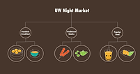
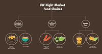
Colors look good. Conrad gives me very thoughtful suggestion on how to change my hierachy. He pointed out that instead of doing it horizontal or vertical, which somehow showed hierachy from left to right or top to bottom, I can show a branch relatioship, where UW Night Market is put in the center and the three categories are put as branches around the center. This shows audiences that those branches are equal hierachy.
Revisions based on this critique
I changed my layout to what Conrad suggest me. My final infographic's relationship display may choose between all three of my different stuctures.